The Supernova Data of Today
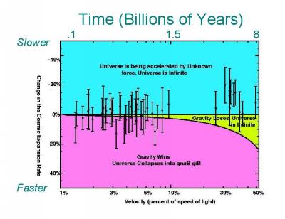
Image taken from http://cfa-www.harvard.edu/cfa/oir/Research/supernova/newdata/data.html
This plot was made by the original teams that discovered dark energy. Along the bottom axis is the distance of a supernova from earth - or, equivalently, the time since it exploded. The side axis gives the change in the rate of the expansion of the universe - as we go back in time, was the universe expanding more slowly (a negative number), more quickly (a positive number), or at the same rate? The three different coloured regions on the plot represent the three possible fates for our universe: its expansion could slow down, stop, and eventually reverse, collapsing the universe in the reverse of the Big Bang (purple); its expansion could continue forever at a constant speed (green); or its expansion could accelerate, getting ever faster and faster (blue).
The supernova observations that this team took generally lie in the blue region, and so we believe that the universe is accelerating. But their data has large errors - the bars on the top and bottom of each point show the range of other possible places that the point could lie. The UltraDeep Survey will create more supernova observations with smaller errors. This will refine what we've already learned, and allow us to learn more about dark energy.